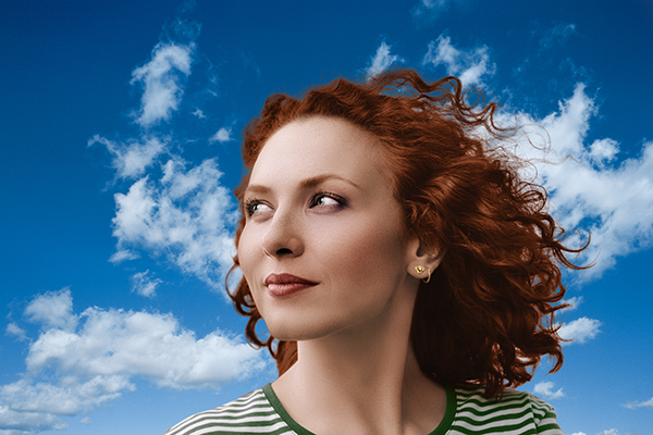
31 January 2009

Awesome Photorealistic Coloring Techniques

In this tutorial we will color a black and white photo using gradient maps, solid colors, and the Color blending mode. Using these techniques, you will be able to hand color any black and white photo in a way that looks photorealistic.

Final Image Preview

Before we get started, let's take a look at the image we'll be creating. Before and after images are shown below. Click the screenshot to view a large color version.

retoushing

Step 1

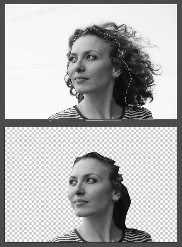
Double-click on the background image to make it an active layer. Create a new group by clicking on the little folder icon located at the bottom of the layers palette and put the layer in the group. Name the group "girl". Draw a path around all the hard edges of the girl. This includes the face and the shoulders. Don't worry about the hair for now; we will do that separately. Save the path. Make a selection of the path by holding Command-clicking on the path thumbnail in the paths palette. Hit Alt+Command+D and Feather the selection by 0.5px. Apply the selection as a mask on the "girl" group.

Step 2

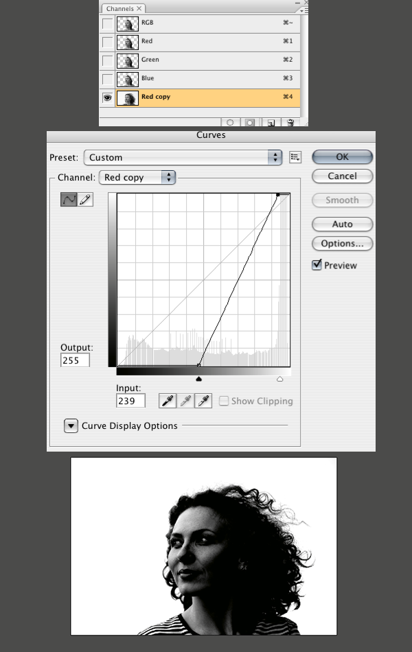
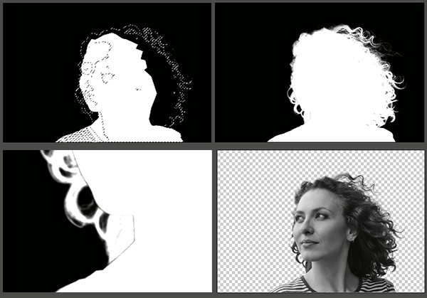
Disable the mask on the "girl" group by holding Shift-clicking on the mask thumbnail. Now in the Channels palette, duplicate the red channel by dragging it to the New Channel button at the bottom of the palette. Apply a harsh curve, like the one below, to separate the hair from the background as much as you can.

Step 3

Hit Command+I to invert the red copy channel. Re-enable the mask on the "girl" group. Load the selection of the red copy channel with your background color set to white. Hit Delete(backspace) to fill the selection with white on the "girl" mask. If you hit Alt+Click on the mask thumbnail, you can see the mask as a channel. Clean up anything that looks as though it shouldn't be there, like that line between the hair and the face.

Step 4

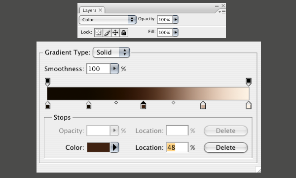
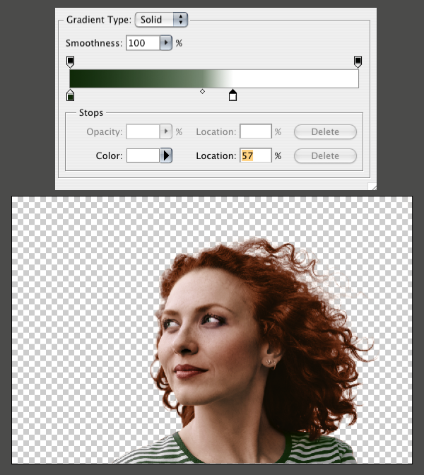
Now let's start to add some color using a Gradient Map. In the "girl" group, make a new Gradient Map adjustment layer just above layer 0. Hit OK without doing anything and set the Gradient Map layer's blending mode to Color. Now double-click on the Gradient Map's layer thumbnail to open up the settings again.

A Gradient Map uses the grayscale data from the image below it to apply the gradient that you create. The left side of the gradient represents the darkest parts of the image. The right side represents the light parts. We need to make a gradient that represents what the woman's skin tone might look like from dark to light. I used the gradient below.

Step 5

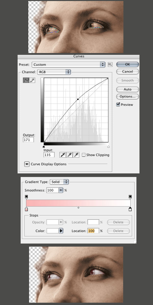
Draw a path around the eyes. Load the selection of the path and Feather it 0.5px as we did before. Make a Curves adjustment layer just above the skin layer. Then lighten the eyes a little bit. Now make a Gradient Map layer just above the curves layer and hit OK before adjusting any settings. Set the new Gradient Map layer's blending mode to color. Now hit Alt+Command+G to apply it as a clipping mask to the curves layer. Now change the Gradient Map's settings to a pink-to-white fade like below.

Step 6

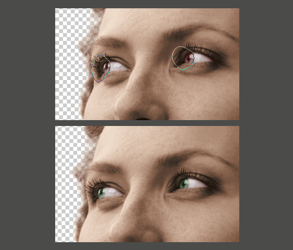
Draw a path around just the iris of the eye. Note that we need only the path to follow that one curve between the iris and the whites because the adjustment we are making will be applied as a clipping mask. Load the selection and Feather it 2px. Make a solid color adjustment layer just above the Gradient Map from the previous step. Then set it to a dark faded green. Hit Alt+Command+G to apply it to the same clipping mask you made earlier. Set the blending mode of the green layer to color. You might have to go back and adjust the green until you get a color that looks real.

Step 7

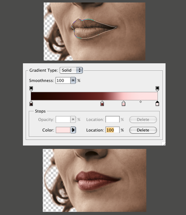
Repeat all the previous steps for the lips, except for this one we'll leave the blending mode of the Gradient Map to Normal, and set the layer's Opacity to 65%.

Step 8

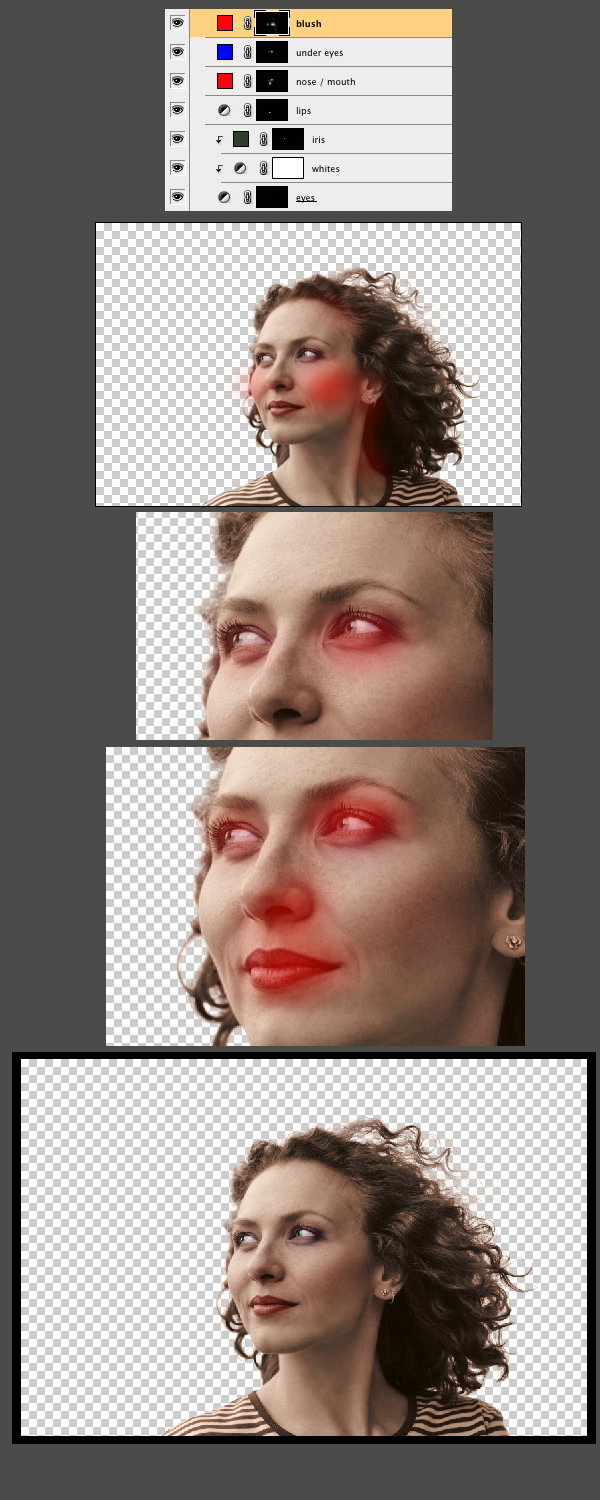
We need to get more variance of color in the skin tones to make it look more real. I made some selections around the eyes, nose, and cheeks. Then I feathered them 20–40px, created solid color adjustment layers, set the blending modes to Color, and brought the Opacity way down to 10-20%. Below you can see my selections as quick masks. The layer palette shows the colors I used for the different areas. As you can see I used some red to add some blush to the cheeks, some red around the nose, mouth and eyes, and some blue to go on the bags of her eyes. These small details make all the difference.

Step 9

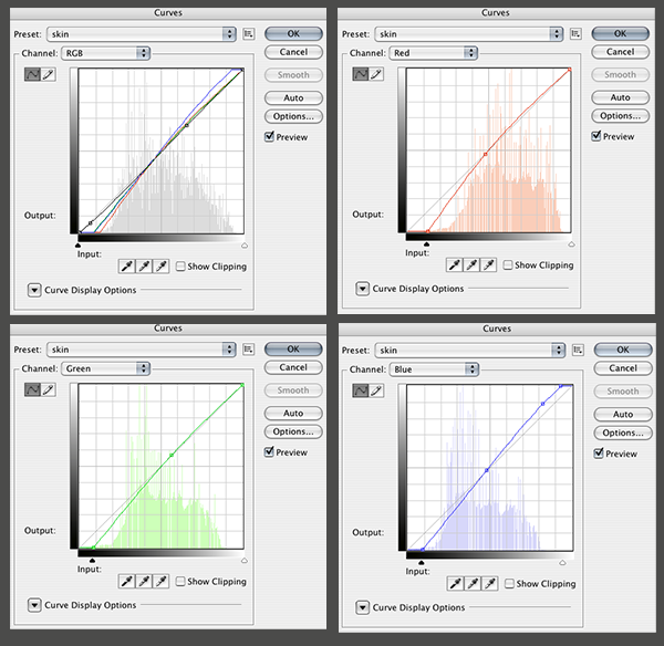
Make a loose selection around the face and neck and feather it 50px. Make a curves adjustment layer just above the 'skin' Gradient Map that we made earlier. I just went in and tweaked the colors a bit to get a little more color variation in the skin tone. You can download the curve file I used here.

Step 10

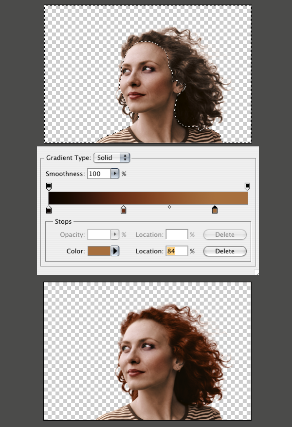
Now we need to make a selection of the hair. I used the path that I saved from Step 1. Then I modified it a little to line up with the hairline's shape and softness. I did this by using Quick Mask Mode(Q), and using brushes of various sizes and softness to match the hairline.

Make a new Gradient Map adjustment layer at the top of the "girl" group. Make the gradient a similar to the image below. I left the blending mode at Normal for this layer.

Step 11

Make a selection of the shirt. Then make a new Gradient Map adjustment layer. Hit OK and set the blending mode to Color, as we have done before. Edit the gradient so that it looks something like the one below. You will have to play around with the gradient until you get a good separation between the green and white stripes.

Step 12

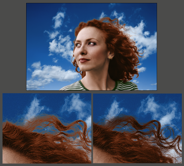
Choose a Sky image. I used one I shot myself, but there are plenty of stock images you could use. Bring it into the document below the "girl" group. Hit Command+T, and size it to fill the frame. It looks good, but notice that our hair mask still isn't really looking that good against the blue background. The hair turns a muddy gray in the transition between hair and sky. To fix this, make a new blank layer just above Layer 0 (the image of the girl). With a large and soft black brush paint over those areas with an Opacity of 15-25% until the transition looks better.

As an added bonus, I applied the techniques from the Super Quick and Easy Facial Retouching tutorial to smooth out her face a little bit. As you can tell, I decided to make her red haired, but you can make your gradients whatever color you would like. She just seemed like a redhead to me. Here is the final image.

Photoshop - Color Correction, By the Numbers

Level: Advanced

While most people do shoot RAW and can tinker their white balance settings (WB) by GUI sliders from their software (such as Lightroom, and PhotoShop), sometimes, it’s beneficial to know how to do it from scratch as well.

Of course, it’ll be best to make sure your WB is accurate to begin with, but the world is not perfect, hence image editing software are made available.

Portraits, in general, require a certain level of color accuracy to make the skin of the subjects flattering. Light skinned subjects has a tendency to look too pink with wrong WB, while dark skinned people can be too orangey.

(Click images to see a larger version)

We’ll be using CMYK (cyan, magenta, yellow, black) to reference our skin tone correction. The premise is, light skin should roughly have a ratio of approximately Magenta Yellow values =5 times the Cyan value.

Before you panic about the equation, it’s really quite simple. If your Cyan value is 10%, your Magenta and Yellow value should add up to roughly 50%. Depending on the obvious color cast, either the Magenta or Yellow value will be higher.

It’s also worth noting that lighter skin tones will have a smaller ratio, usually a M+Y = 3x C, instead of 5x C… Conversely, dark skin tones will have a higher ratio.

These are just guideline figures as human skin tones vary greatly from race to race.

Here we go.

Here’s the original image with severe color cast from the tungsten lights in the room with the camera’s white balance at (auto) AWB setting.

1) Open your image and select your Color Sampler tool. I prefer to pick a larger sampling area (CS2 only allows up to 5×5, I think CS3 can go much higher).

Click on a non-reflective part of the face that you want to use as a reference point. I prefer the middle cheek, forehead, chin, or nose bridge in most cases. Here, I chose the area between the eyes.

I also sampled the background wall as I know that the wall is off-white with a hint of pink. If I can get that close to actual, then I know I’m close to correcting the skin as well.

2) Now look at the INFO palette, you’ll need to look at the CMYK values, so click on the little airbrush icon and choose CMYK Color from the drop-down list.

3) Our first sampling point is the skin, you’ll see the values in the red box. You’ll notice that the Y-value is really high, so we need to tackle that first.

Note the right sampling point of the wall. Since I know the wall is near-white, the number should reflect on the high-200 value.. The blue channel is obviously causing some color cast onto the wall.

So based on those alone, we know that we have to mainly fix the Yellow channel first, then adjust the others in small increments.

4) The opposite color of yellow is obviously blue. So we open a Curves adjustment layer and change the Channels to Blue (instead of RGB). Use the color dropper to click on the sampled spot and it’ll display where that sampled color is on the graph (you’ll see a square appear along the line).

Drag that line upwards (adding blue values) to reduce the yellow value. You’ll see that most of the yellow color cast is gone. The image looks more “normal” now, but we still see some pinkish cast, so we’ll need to look at the red channel next.

5) Now select the RED channel from the drop-down list and click the sampled point again to see where to adjust the curve. Once you’ve found the spot, drag the curve DOWNWARDS to reduce red value. This’ll reduce the Magenta values. Move it until you get the rough ratio above (5xC=Y+M).

Note that you don’t have to get it exact. Read the top of this page.

6) Finally, choose “RGB” from the Channels drop-down list and make a simple “S” constrast curve to complete the correction.

Hope you guys found this useful

Super CCD EXR

Revolutionary sensor blazes the way to a new era of high image quality
“Super CCD EXR”
A ‘three-in-one’ sensor for high resolution, high sensitivity and wide dynamic range
Made by photographic specialists for photographic specialists

PHOTOKINA 2008, COLOGNE, GERMANY, September 23, 2008 —FUJIFILM
Corporation, on the anniversary of 10 years of FinePix cameras, has developed “Super
CCD EXR,” a revolutionary new sensor developed in the rigorous pursuit of high image
quality.
There is strong demand in the digital camera market to increase the number of pixels on
a sensor, which, all too often, is used as a convenient yardstick for image quality. While
introducing excellent 12-megapixel cameras such as the FinePix F50fd and the FinePix
F100fd, Fujifilm has had great success in increasing pixel density while at the same
time controlling noise and optimizing sensitivity. Fujifilm’s campaign to improve
overall image quality, while at the same time increasing sensor resolution, has been
coordinated under the program of ‘Real Photo Technology.’
‘Real P................................  

Introduction to digital photography

Digital photography has come a long way in a few years. It's fast, efficient, and more cost-effective than the old ways. And best of all, digital photography just keeps getting easier and more enjoyable.
• Digital takes the fear out of photography by letting you take as many pictures as you want.
So many advantages
• You can see right away if you got the picture you want, and you can delete pictures you don’t want.
• Upload pictures and share them with friends and family anytime, anywhere using a computer — or even a mobile phone.
• Digital costs less because you don’t buy film and you don’t pay to print photos you don’t want.
• People use digital photography in their work every day — police officers, real estate agents, insurance agents, fire fighters, scientists, and doctors, just to name a few.

Getting started with digital photography

Think you need a digital camera to have fun with digital photography? Think again. All you need is access to a computer and you’re ready to go.
Taking pictures
•There are several ways you can get pictures ready for a computer:
Scan existing prints and burn a CD
•Scan pictures that you’ve already taken. Whether you have a scanner at home or school, or have access to scanning services through a photo developer, getting favorite photos on a CD lets you quickly and easily copy these cherished memories to a computer for editing, printing, and sharing.
At the one-hour photo request a CD instead of prints
•When you take pictures with a film camera and take them to the one-hour photo for developing, have the pictures put on a CD instead of getting prints. This way you’ll still have access to all the benefits digital photography offers.
Use a digital camera There are lots of different types of digital cameras. Before you buy, make a list of the “must have” features to find the right one for you.

Top 10 digital myths

The early days of digital photography had some problems. Cameras were expensive. Photo quality was not good. There weren’t a lot of tools to handle digital photos.
Top 10 digital myths
Since then digital cameras have gotten a lot better. So have the photos they make. The tools available to manage photos have made digital easier than ever, too.

1. A digital photo is not as good as film. Today’s digital cameras produce great-looking photos, even in large print sizes. Film is good and improving, too. But digital easily keeps pace.
But there are still some people who have a negative view of digital photography. So here are the Top 10 myths…exposed:
2. Digital cameras are big and heavy. There are a lot of small, featherweight digital cameras that have loads of features. They create top-quality photos, too.
3. Digital cameras are slow. For a long time, digital cameras were slower than their film cousins. Every year, digital cameras get faster.
Digital photography guide
© 2008 Adobe Systems Incorporated Introduction to digital photography 3
4. Digital photography is expensive. Digital keeps getting cheaper. Someday soon it won’t cost any more than film.
5. It takes too long to transfer pictures to a computer. Get a USB or FireWire memory card reader to make quick transfers. The fastest card readers can copy three or four high-resolution JPEG photos to the computer in one second.
6. It’s hard to view and edit digital photos. Not any more. For example, Adobe Photoshop Elements 7 is available for less than US$100 — and it's surprisingly easy to learn and use.
7. It’s hard to make prints from digital photos. Printing digital photos is easy. You can print at home, or on the Internet using an online photo service.
8. Prints from digital photos look bad. It is almost impossible to tell the difference between digital prints and traditional film prints.
9. It’s hard to organize and store digital photos. Adobe Photoshop Elements 5.0 software lets you organize photos by category: family, friends, school, vacations, and pets. Protect your original photo files — also called digital negatives — by burning a CD and listing its contents on the disk.
10. Digital photography is too much fun. Sorry…this one’s true!

EXECUTIVE SUMMARY: EDITORIAL LICENSING

  1. Editorial publication rights are not typically granted to architects unless specific allystated in a written licensing agreement.
  2. publication’s content is its most valuable asset, attracting both readership and advertisers. If the publication refuses to acknowledge the value of photography and does not secure an editorial license, the responsibility for licensing the rights may revert to the architect.
  3. A photo credit is not equal to the value of the content (images) received by the publisher.